
We all can agree that we have seen a resurgence for all things retro in the past year: from the bright colors of the 80s to the grunge look of the 90s and even the Y2K era. These trends are even spilling over into the way brands are advertising. The 80s editorial aesthetic is back with its love for large serif fonts, tight line spacing, and simple product photography.
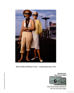
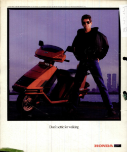
The iconic ads from the 80s that come to mind are from Apple, Honda, and American Express. These works all capture what was super popular in design – they all use serif fonts, tight line spacing, and some sort of photo feature.
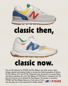
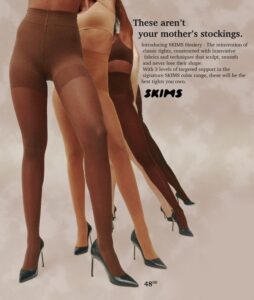
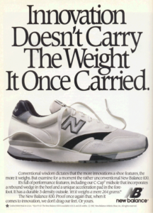
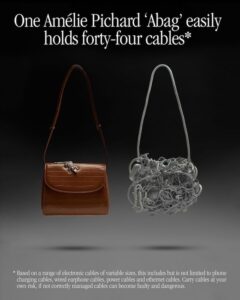
Given the state of the world, most people are looking back towards what some consider “the good times” and are resonating with the nostalgia of 80s design. Brands like New Balance, Skims, and Amelie Pichard are returning to this familiar ad style, and people are certainly enjoying it.
It is not completely surprising, given that every 20 years, trends tend to come back around. But it is a stark difference from the minimalist style that has ruled the last few years. Designers are returning to the maximalist design style, and brands’ target audiences are into it.
While the 80s aesthetic itself is not what is resonating with buyers, but rather the feeling of nostalgia. People are getting that warm fuzzy feeling from seeing retro-inspired ads and are making purchases based on that.
Gen-Z is also heavily influenced by these ads because they didn’t experience those decades without modern technology. The younger generations are drawn to the different styles in their feed because it is not what they are used to seeing. They romanticize the “simpler times” of their parent’s generation and move toward the look and feel of the retro aesthetic.
The 80s are back, and while some may be opposed, it is refreshing to have a break from the tired, monotone content we have seen on our feeds.