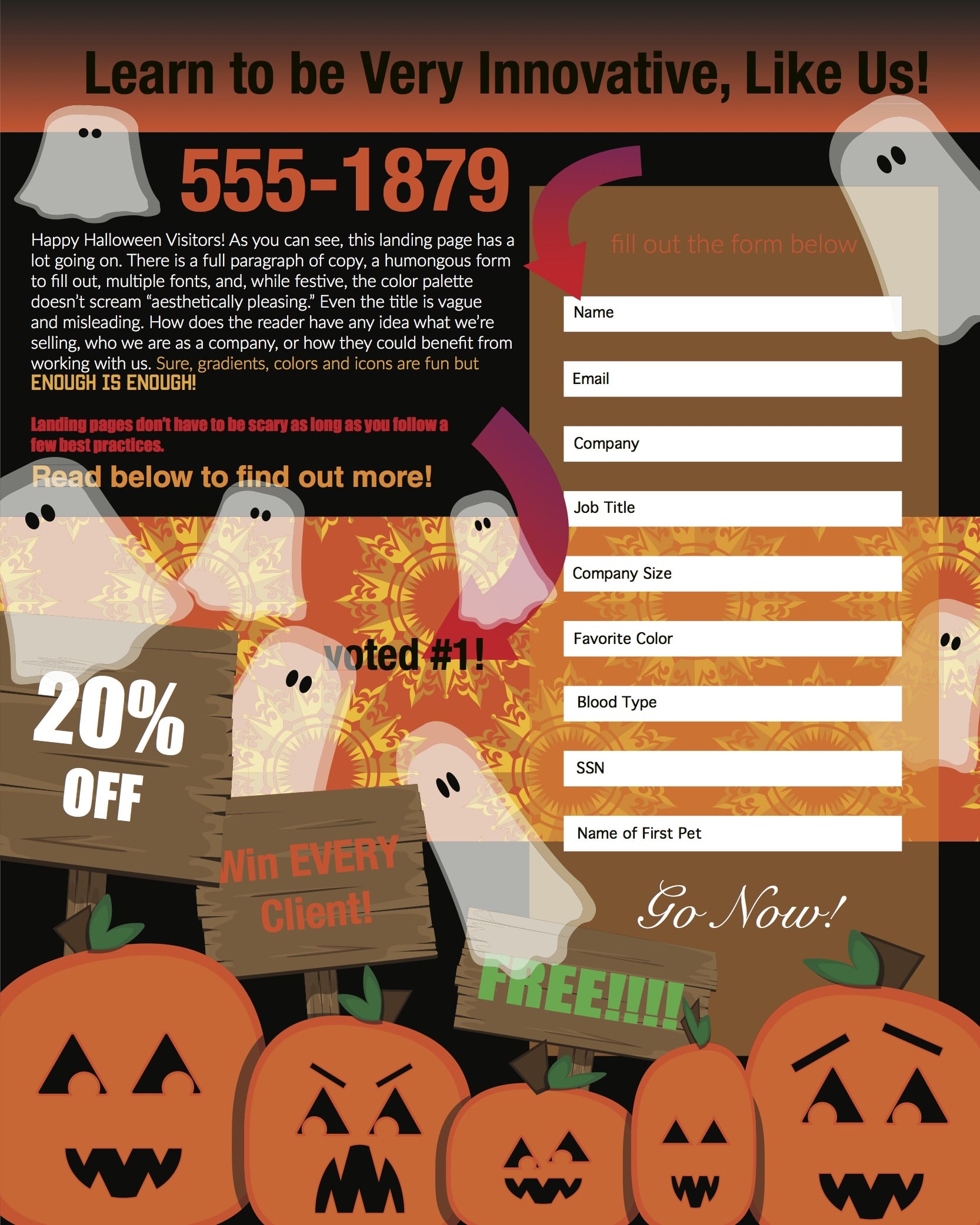
In today’s marketing environment starting a campaign demands having a landing page. There is currently no better way to facilitate lead generation. Landing pages give people something they need and, in return, you get their information and the chance to create a relationship. While effective, landing pages can still be tricky because of today’s already-skeptical digital audience; people are hesitant to give out their information to just anyone. Is your landing page contributing to these fears? If you are utilizing too many graphics, dull copy and confusing calls to action, like the example above, you most likely are. To help you out, I have identified 5 best practices to adhere to when designing a landing page.
1. Less is More
When designing a landing page, channel your inner Coco Chanel. One of her more common refrains “Before leaving the house…look in the mirror and remove one accessory.” The same should be said about landing pages. In the age of flat, minimalist designs, landing page aesthetics are key. Too much junk cluttering your page and distracting the potential lead will only decrease your success. Multiple fonts, sizes, colors, icons, and backgrounds mixed together, make it difficult for the viewer. Keep it simple; keep it attractive; and get straight to the point. Never underestimate the beautiful power of whitespace.
2. Button Up
The most important part of a landing page is the button. If there isn’t a button to click, you won’t get the information you desire and your visitors won’t benefit from your offering. As the most crucial component, a button needs to pop. Think contrasting but complementary colors. Apart from the title, buttons should be the most eye-catching visual on the page. Buttons should also appear clickable. Often, when a button is just words or a basic shape, it is less intuitive to visitors. Beveling, drop shadows, or borders can enhance the button’s utility. Buttons also need to have a specific call to action (CTA) that corresponds to their function. If you’re offering a free whitepaper download through your landing page, it wouldn’t make sense to display “Go Now” on the button. Think carefully about this copy. It should be concise but specific.
3. Play Your Cards
Visitors arrive at on a landing page because they followed a click path. If someone is searching for information about millennials and they see an ad that promises to answer all of their questions and confusions, they’re more likely to click! Arriving on a vague landing page forces hesitation to set in. People won’t give out their information if they don’t know exactly what they’re going to get or don’t trust the source. One way to ease this reluctance is to display your offer’s cover. Visuals are eye-catching and establish transparency from your company.
4. Get to the Point
Short attention spans dominate the digital audience. When creating a landing page, assume that most visitors will scan from top to bottom instead of reading each word. To combat this, you can keep the entire design short and sweet with a minimalist design to leave viewers wanting more. Alternatively, another way to promote viewer interest is to highlight copy that packs a punch. Using bold or block letters, highlight the phrases that will encourage viewers to keep reading. This shows the viewer they aren’t alone and your company can help. By breaking up copy on the page you are allowing for more white space and design to have a cleaner look. If you can’t find any interesting copy to highlight that truly hooks the viewer, rewrite it until you can.
5. No Escape
While every company wants to drive traffic to their website and social media profiles, the point of a landing page is to promote a specific offer. By filling the landing page with links to email addresses, websites, and Facebook pages, companies are diverting potential clients away from lead generation forms. Viewers should only see one clickable option on the page: the button. Consider stationing website and social links on the confirmation page that viewers see once they have submitted their information for the offer. By limiting links on landing pages, you are giving viewers less “ways out” and encouraging them to sign up.
Landing pages are an excellent way to show off your expertise, gather lead information, and provide content to potential clients. By addressing these five best practices, you can improve your pages’ efficiency and effectiveness. To read more about digital marketing and strategy, check out this section of the initiate-it blog: Digital Marketing
Posted by Libby Rosebro, Digital Designer at initiate-it, and Tom Hinkes, Digital Account Executive at initiate-it.

